Today I got a little project from one client to deliver the news letter design. So I downloaded the "Mailchimp" software, and registered my id for it. Then I found an interesting design solution.
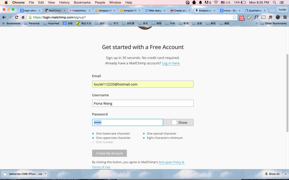
(sometimes websites need a lot of information for registration) Usually I as a user met problems in setting up my password. Because each website has their own rule for password. There are 2 popular approaches for showing password rules. First, the rules are hidden, you can see the rules when you click the "rules". But you never know what will happen next, so usually I will not click to the "rules". Because I experienced with a lot of bad designed websites, once you click something, it will load another new page, and you can never be allowed to go back. The second approach is even less desirable. Those websites will not tell you anything until you made mistakes. Websites like those do not show you rules to follow in setting up your password, until you fill in everything and click the "submit" button. What will happen next? It will show a window with the description of the rules. And then you know the rules but you need to refill everything (sometimes websites need users to fill in pages of information for registration) again!!!
The following pictures showed the registration process for "Mailchimp", which makes me as UX designer very excited.
In ''Mailchimp", we as users can see the rules clearly at the beginning without any clicks. What's more, every time I meet one rule, the blue bullet will turn into grey bullet. So users will be clear with how many rules they need to follow. And they will no more be afraid of making mistakes in setting up password, losing all the data and going over all again. They can pass this process successfully at once.
See, good designs can make life easier.
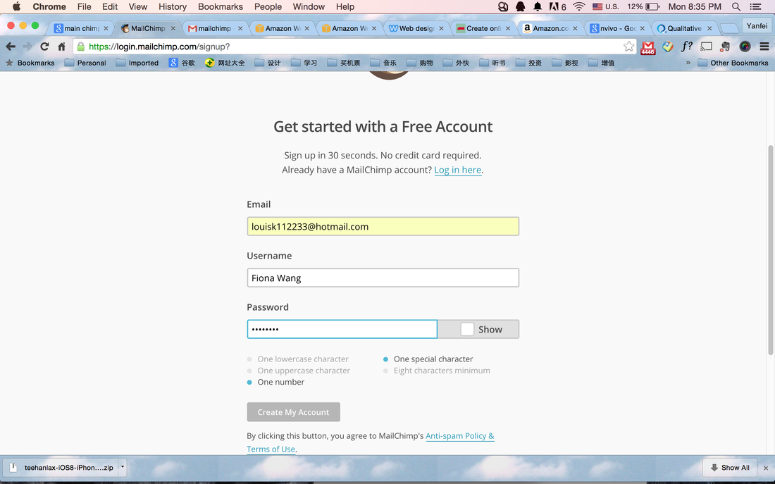