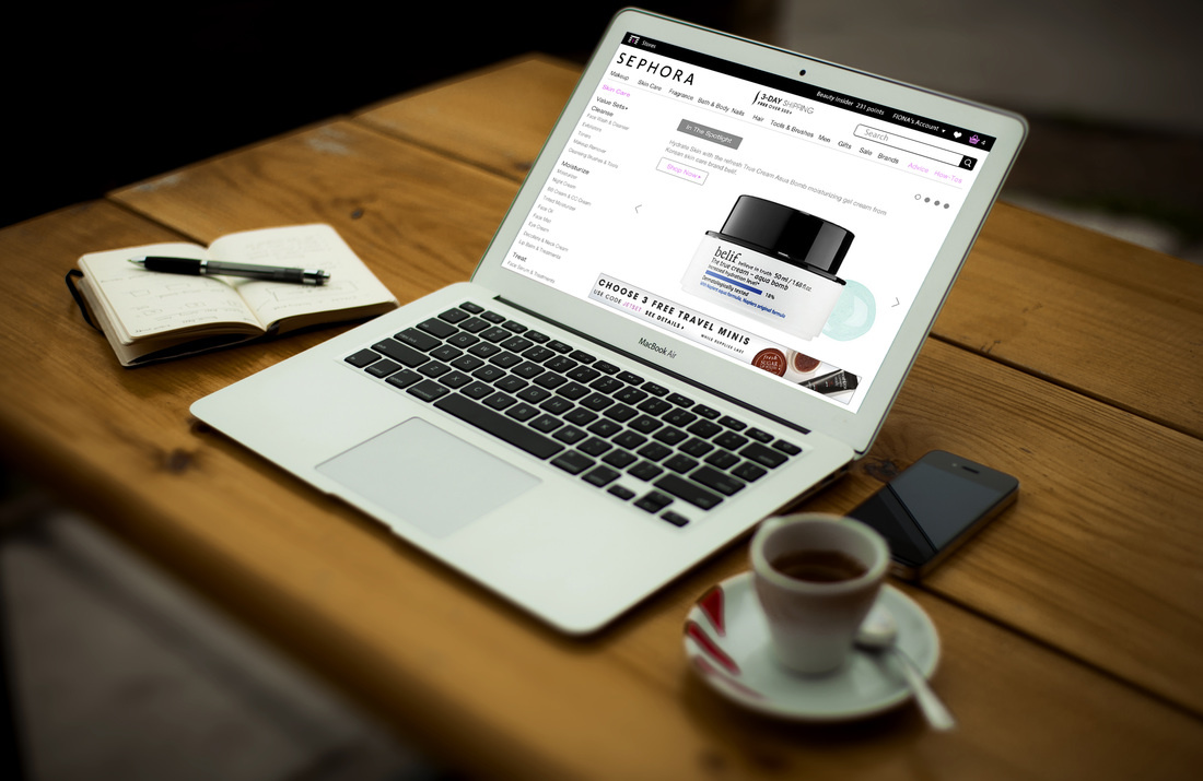
Previous Webpage Look

|

|
Previous Webpage & Competitors' Webpages Analysis

- The “Account”, “Search” should be on the right side on the top page. Because more than 80% of the shopping webpage put those information on the right side. Therefore, if we keep those on the left like the previous page did, it will be opposite to the using habit of most users. With the same reason, the "Sephora" logo might need to go to the left.
- Almost all the font used on this webpage are black style. However, based on previous user research black style are hard to read for online users because of its unique features. So I also changed the fonts style.
- At the same time, instead of using black for all the text, I also used dark grey and light grey to help users understand the hierarchy of the menu. I also change the "red" color into "pink". Because red text will cause the uneasiness of users. As we always use "red" text for system errors. On the other hand, "pink" can represent the female characteristics more than red.
- I enlarged the size of the advertisement part on the top of right part, and move the page title-"skin care" away. Because the page title they put there is more like part of the ad. What's more, based on users habit, rare people will see the title name there in previous page design.
- The other changes I made are about modules ("just arrived", "bestsellers", "face masks", "cleansers", "hot skin cares" and etc.) on the right part. First, I add a new module-the "recent viewed" module, which is important for users to track their viewing history. And then I deleted the modules of "face masks", "cleansers", "hot skin cares", which might be too specific for web visitors.
Webpage Redesign
|
Wireframes

|
UI Design

|
